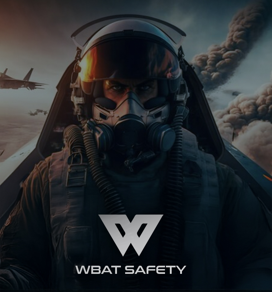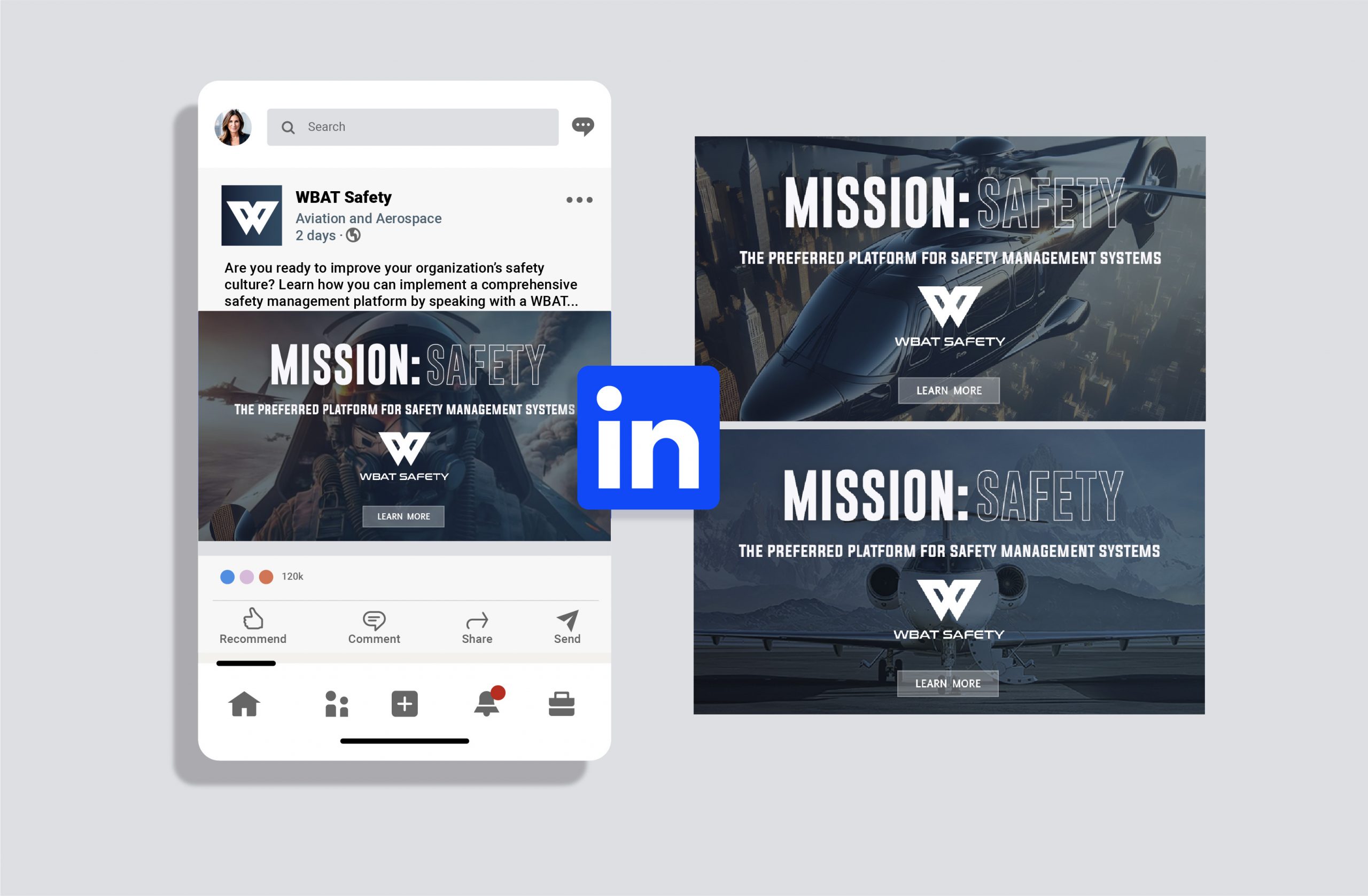
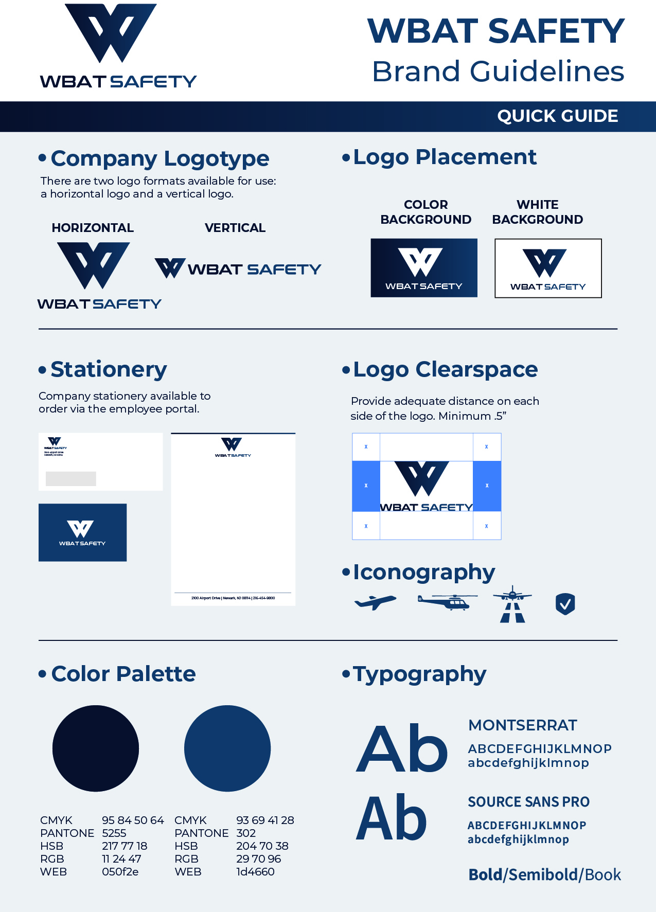
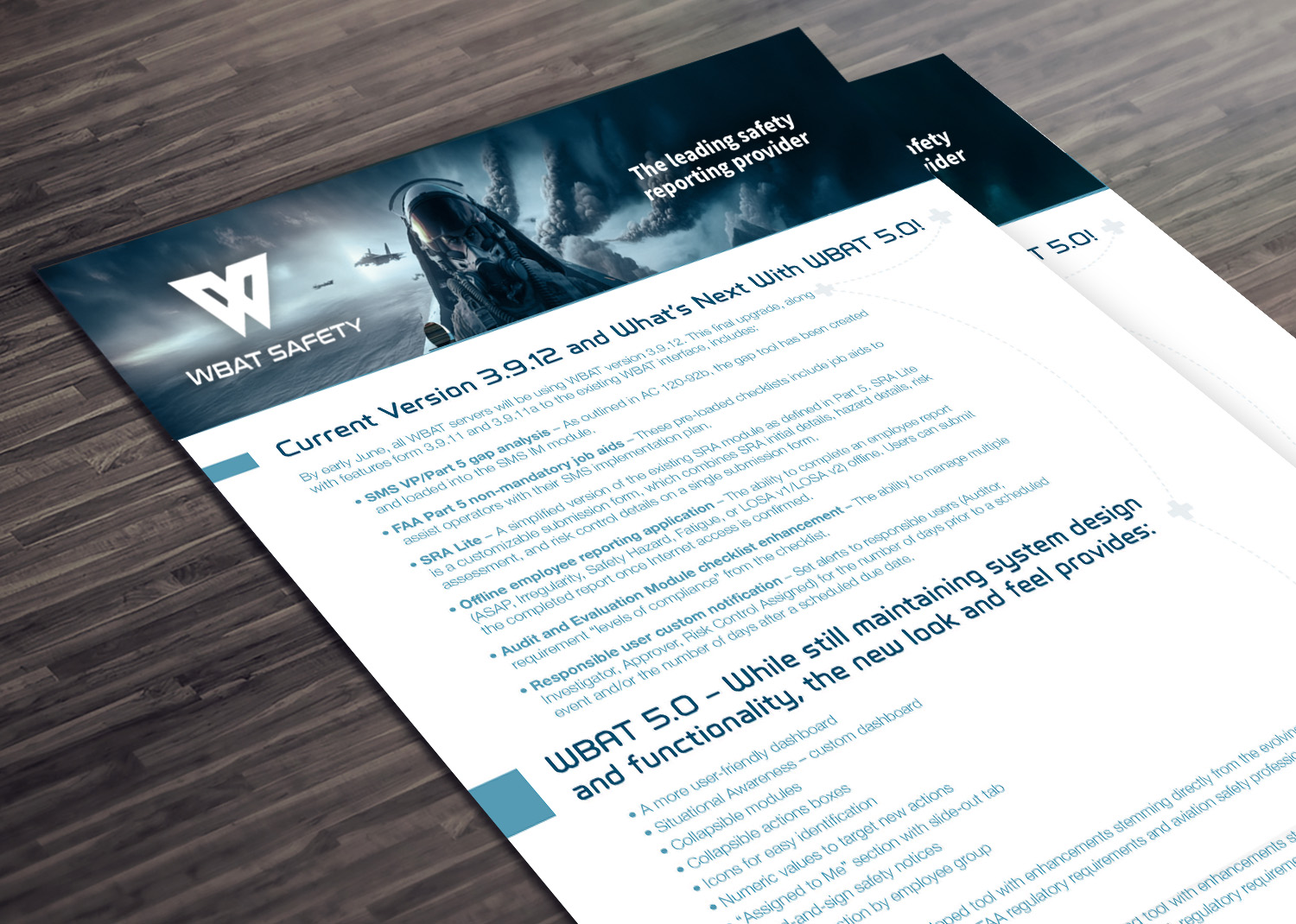
WBAT Safety, a web-based safety management solution, needed a unique logo to strengthen its brand and attract new clients. We built a brand that speaks to its audience and mission. Using a stable slate blue, reminiscent of aircraft, combined with a military-inspired font and an iconic “W” featuring a flight element, we forged a distinct identity. This resulted in a complete set of brand assets, from the logo and guidelines to social media graphics for various campaigns.
For the rebranded safety company, our work extended beyond just creating a new look. We also developed and executed a comprehensive social media campaign. This campaign was strategically designed to launch their refreshed identity, engage their target audience, and clearly communicate their renewed commitment to safety across all relevant platforms. It ensured the new brand wasn’t just seen, but actively experienced and understood by their stakeholders.
